


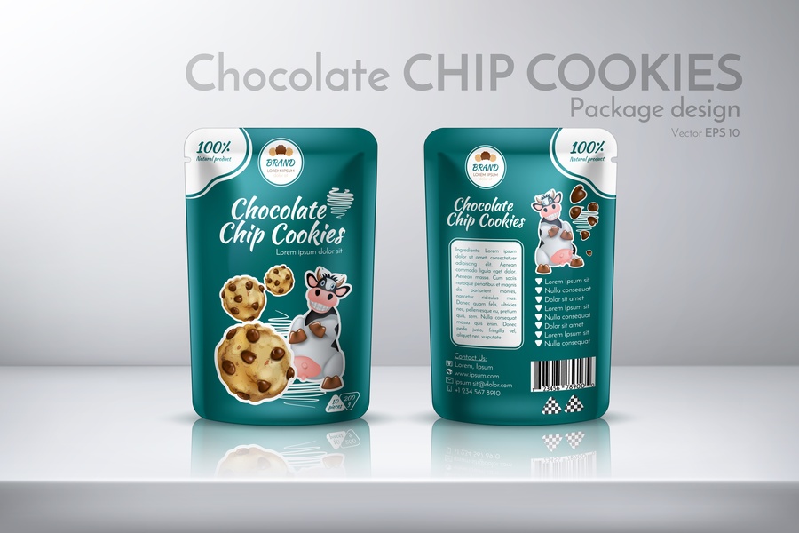
Before a customer tastes the sea salt caramel cluster, the package is already doing the flirting. Food manufacturers can create that first little “ooh” moment by making the product appear worth a closer reach. What gives packaged foods a more premium look is the mix of smart restraint and one memorable detail that makes the packaging confidently designed. When the outside has that kind of presence, the food inside gets a stronger first impression.
A Color Palette That Feels Curated
Premium food packaging usually avoids visual chaos. Instead, it leans into a focused palette that gives the product a clear personality, whether that means warm neutrals, moody jewel tones, soft pastels, or one bold signature color. A limited color story helps the shelf presence be calmer and more confident. As a result, the package looks designed instead of decorated.
Texture That Adds Instant Interest
Texture gives packaging a tactile quality that flat design cannot always create on its own. Features like matte finishes or embossed logos can make a package feel more elevated in the hand. Even before the customer tastes the product, those details suggest extra care. Because food is inherently sensory, touch can quietly support the promise of quality.
Structure That Holds Its Shape
The form of the package matters as much as the artwork printed on it. Clean edges, sturdy panels, and smooth closures can make a product reliable and refined. For example, folding cartons are ideal for retail food packaging when a brand wants strong shelf visibility and room for polished branding. Strong structure also helps the design stay attractive from shipping to display.
Typography With Personality
Typography can make packaged food playful or modern within seconds. However, premium packaging usually uses controlled fonts so the design stays easy to understand. One expressive typeface can carry the brand voice, while simpler supporting text keeps ingredients and claims clear. With that balance, the package stays stylish without becoming hard to navigate.
Details That Make the Brand Feel Finished
Small finishing touches separate standard packaging from premium packaging. A clever seal or a clean back panel completes the experience. These details should serve a purpose instead of crowding the design. When every element earns its place, the whole package appears more expensive.
Premium-looking food packaging does not depend on one dramatic design choice. It comes from details that feel deliberately chosen. What gives packaged foods a more premium look is the sense that nothing about the package happened by accident. That kind of polish makes a product feel easier to trust and remember.